Showing posts with label Design for web. Show all posts

Friday, 6 December 2013

OUGD504 Design for web: Numiko lecture

OUGD504

DESIGN FOR WEB
NUMIKO LECTURE

Numiko are a Leeds based company who have worked with a multitude of high profile clients who want website and other digital media. Below are some notes I have taken from the talk.


Designing for screen by Matt Tweedle and David Eccles.

Digital agency in Leeds.

What do they do?

Digital things
public and entertainment sectors
dont sell thing and make produces that are usable and meaningful.
Clients: channel 4, bbd, disney, design council. nhs, university of leeds, nspcc, water aid, cancer research and nesta


Why are the limitations of web?

too many limitation
designers need to be able to code
designing websites all the time must get boring
web designers lack an understanding of esign principles
you need to move to london to work on high profile projects
we believe these are all wrong.

Limitations that are disapearing

typography
responsive grids
scaling vector graphics (SVG)
html5, canvas and open GL
connection speeds.

Designers don't have to able to code.

Not boring, web is constantly evolving with technology and a host of new exciting challenges. Maturing industry, we take design seriously.

- Clients.

Nesta

Make stuff do things.
Cube, a single pixel the start of digital making. 
Considering what else it can adapt to like mobile phone apps.

WaterAid

A lot of illustrations, type and colour.
Commuincate a need  for water and it's impact.

Lewis Hamilton

A timeline of his life.
Modern and personal.
Social networks to promote his personal life.
Similar to design for print.
Iconography is a good foundation to do all of the stuff for web.

The Lottery
Office for National Statistics
Channel 4
IPTV
Film 4
BBC

Design Council

Discover. define. design, develop, deploy.

Understanding audiences: who they are, what they need, to understand their digital lives, to understand your organisational needs from a digital platform. to ensure we're answering the right questions throughout the project.

Developed personas for people / potential target audience to consider user  needs.

Finding the right balance between something that is over the top and intuitive  To something simple and is aesthetically pleasing.

Clear - Flexible - Simple - Creative.

User-centerd.

Mobile first. 

Device agnostic.


GUDING PRINCIPLES.

 Focus on content: reduce interface debris and focus in delivery of content

Make it simple: functionality should be designed to be entirely intuitive and obvious

Embrace less is more: strive to achieve the same functionality through as few visual elements as possible without sacrificing clarity.

Be consistent: use concisistent design patterns to reduce user thinking time

Consider context

Be bold

Development for a client or website.

Proposal: 3 weeks
Final: 6 - 8 weeks

Not many designers on a project, they have some what ownership. For placements they work on live breifs and get placements for two weeks.

Skills

Typography designers.
Illustrations / Digital illustrations.


I really enjoyed this talk, it showed all the possibilities you can create in web which is was a source of influence in the production for this module.

Monday, 25 November 2013

OUGD504 Design for web: Aesthetic research

OUGD504
DESIGN FOR WEB
AESTHETIC RESEARCH

For my aesthetic research i have looked at a number of different non profit organisation web sites.


I really like the simplicity of this website i think that the simple info graphic works well and is something that i could incorporate in to my own website.


I like the use of photography in this website. The colours are also appropriate to the theme of the website. When designing my web sight i need to pay particular attention to the colour scheme and the connotations that those colours give.


I really like the concept behind this website i like the full page photography layered with text. I think the vibrancy and colour of these photos is eye catching and interesting.


the use of one bright eyry catching colour really works to grab the audience's attention.The colours yellow and black together also connote danger and caution.


Wednesday, 20 November 2013

OUGD504 Design for web: Content research

OUGD504
DESIGN FOR WEB
CONTENT RESEARCH

The images for my website should be challenging and controversial, but not so harrowing that they turn people away from my website.


The Deepwater Horizon oil spill (also referred to as the BP oil spill, the BP oil disaster, the Gulf of Mexico oil spill, and the Macondo blowout) began on 20 April 2010 in the Gulf of Mexico on the BP-operated Macondo Prospect. It claimed eleven lives and is considered the largest accidental marine oil spill in the history of the petroleum industry, an estimated 8% to 31% larger in volume than the previously largest, the Ixtoc I oil spill. Following the explosion and sinking of the Deepwater Horizon oilrig, a sea-floor oil gusher flowed for 87 days, until it was capped on 15 July 2010. The total discharge has been estimated at 4.9 million barrels (210 million US gal; 780,000 m3). After several failed efforts to contain the flow, the well was declared sealed on 19 September 2010. Some reports indicate the well site continues to leak.
Numerous investigations explored the causes of the explosion and record-setting spill. Notably, the U.S. government's September 2011 report pointed to defective cement on the well, faulting mostly BP, but also rig operator Transocean and contractor Halliburton. Earlier in 2011, a White House commission likewise blamed BP and its partners for a series of cost-cutting decisions and an insufficient safety system, but also concluded that the spill resulted from "systemic" root causes and "absent significant reform in both industry practices and government policies, might well recur".
We believe that BP's assets must be siezed. Help stop these monsters by signing our petition to seize BP.

The 2010 Deepwater Horizon oil spill in the Gulf of Mexico has been described as the worst environmental disaster in the United States, releasing about 4.9 million barrels of crude oil making it the largest accidental marine oil spill. The spill has affect many people around the world. Fishermen’s trades have been ruined as well as the havoc and devastation it has cause to much of the wildlife. Many people have become sick from eating contaminated seafood. Beautiful white beaches have been plagued with dead sealife and thick oily deposits, directly affecting some of the most exclusive and beautiful holiday destinations in the world. The oil spill was called the "worst environmental disaster the US has faced" by White House energy adviser Carol Browner. The spill was by far the largest in US history, almost 20 times greater than the usual estimate of the Exxon Valdez oil spill. Factors such as petroleum toxicity, oxygen depletion and the use of Corexit are expected to be the main causes of damage.
Three years after the oil spill, the residual effects are still apparent, with tar balls still found on the Mississippi coast, as well as an oil sheen along a coastal marsh, and erosion on an island in Barataria Bay sped up by the death of mangrove trees and marsh grass. On going efforts are still under way to clear the area and preserve the natural habitat.

The Gulf of Mexico oil spill relief is for seizure of assets to provide relief. The amount seized can be assessed by an agency determination, updated on an ongoing basis, of current known damage estimates. Because damages occur over time, asset seizure and set-aside can be done over time. Whether the seizure or assessment has the result of impairing BP’s operations depends, ultimately, on the damage it has caused. Given BP’s capitalisation, assets and revenue-producing abilities, it is not a foregone conclusion that its operations would be dissolved or sold or even impaired. It is imperative that the government seize BP’s assets now for their criminal negligence and begin providing immediate relief for the immense suffering and harm they have caused. THE TIME FOR ACTION IS NOW.                            

Wednesday, 16 October 2013

OUGD504 Design for web: Web lecture

OUGD504
DESIGN FOR WEB
WEB LECTURE

Cern is the European Organization for Nuclear Research and was were the internet was born. 
The internet was created 1991 - Switzerland 
Started 1991
Tim Burnerslee


'' To link and access information of various kinds as a web of nodes in which the user can browse at will''


The first ever internet page looked like this, very minimal, monochrome and text based.

 Web Servers:


The worlds first web server, was introduced by a next computer that was designed and built by Steve Jobs.


First Web Image: 1992 'Les Horribles Cernettes'  


In 1992, the first image was uploaded to the internet and was in the form of a PNG file. A universal file format.


Part 2

Terminology

Code: What the websites are made from
HTTP: Hyper Text Transer Protocol
HTML: Hyper Text Markup Language
CSS: Cascading Style Sheets (What makes websites look appealing / thought and context.)
FTP: File Transfer Protocol (Sends a large body of information to another computer, e.g Google create a websites design when the link is clicked on)
CMS: Content Management System (content change and updates)

- Static websites dont change
- For good website it needs to be dynamic.
Skeuomorphism: A derivative object that retains ornamental design cues from structures that were necessary in the original.


This is an example of skeuomorphism because there are magazines on a news stand shelf but when its featured on screen its ment to be digital and we should be able to just slide through images of the next pages rather than it be a book with turning pages.

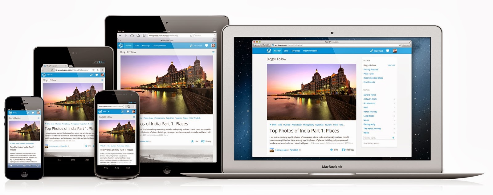
Responsive design: ' Could be reactive design' It is ' Responsive' because the design 'responses' i.e can be adapted to a variety of media using screens of various sizes. 
  • The concept was introduced by Ethan Marcotte


This is an example of responsive design. This a website that works across a variety of platfroms, from the laptop, iphone and tablet.

Part 3 
Design
You can use a grid on any website
The grid is the most important tool.


A website is designed by a grid system. The grid is the most important tool used by a designer to keep consistency.


When creating a website you should always think about the considerations, and weather it will enrich your audience.
What is the purpose of the website?
Who are the target audience?
What do the target audience need?
We then though about how we could create a website that was relevant to us as graphic designers
Purpose: showcase work, promote, jobs
Audience: potential clients, local companies, variety of work
Needs: Images, easy to navigate, engaging, stand out, contact.

Websites + Books 
www.awwwards.com
www.webdesignledger.com
www.fivesimplesteps.com
www.piccsy.com/everything-design
www.aisleone.net
Books 
HTML + CSS 
Practical guide designing for web
Scratching the surface - Adrian s.
For the next part of the seminar we looked at some websites as a class and said the first word we thought.
BBC
Cluttered 
White
Busy
Blocks
Monochrome

Bicycle website
Clean
Bike
Grey
Minimal
Ling cars
Pop up
Magazine
Cheap
Cluterd
Crazy
Disgusting
Flashy
Cathedral
Medieval
Game
Tacky
Inappropriate
Pop up
Legwork studio
Bad Navigation
Unorthodox
Un-engaging
Bad use of type
Inexibit is a good website to go on - another behance, designers & illustrators exhibit there work.