Showing posts with label OUGD501 studio brief 2. Show all posts

Friday, 2 May 2014

OUGD501 Design Context: Design production

OUGD501
DESIGN CONTEXT
DESIGN PRODUCTION


BINDING THE BOOK:

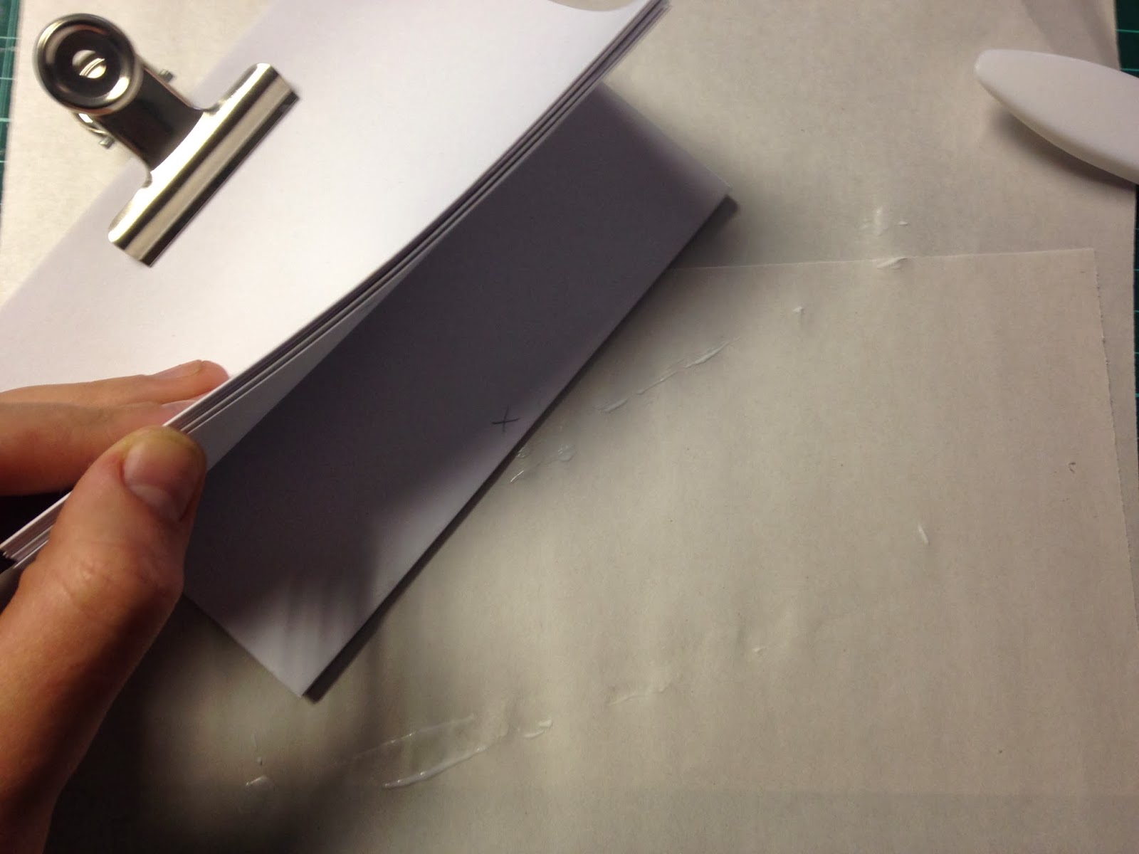
I tried a number of different binding techniques on different mockups. I faced a problem as my concertina book was far too large to print on one piece of paper double sided to produce a seamless concertina. I came up with the solution of printing double page spreads individually then sticking them together.I tried 3 types of adhesive to test which would give me the most seamless and polished final product. I tried PVA glue, Spray mount adhesive and double sided tape. I found that although the PVA glue and spray mount were more forgiving, and easy to correct if stuck down insufficiently they were very messy and gave the concertina a shabby, messy and unprofessional appearance. Double sided tape was a challenge to use as there is no room for error because once it was positioned it was stuck down strong, with no way of repositioning.


I started the process by positioning the concertina so i could see which page went where.


Next I started to assemble the book page by page, This was a slow process. I found that the spray mount mockup was the easiest to do but also the less precise.


Wednesday, 30 April 2014

OUGD501 Design context: Poster design

OUGD501
DESIGN CONTEXT
POSTER DESIGN


To start the process i created the desired layout of the posters, I followed the same text positioning and colour scheme as my concertina book in order to create consistency


I next created a grid structure using columns of 4 equal widths. This is a guide for when I combine and collate the posters in the correct order.


Using photoshop I then cut each section of each image and rearranged them in an alternating order.


After conducting a print test i decided to add lines to the posters in order to maintain consistency throughout the product range.


Friday, 25 April 2014

OUGD501 Design context: Design decisions

OUGD501
DESIGN CONTEXT
DESIGN DECISIONS

AESTHETIC:
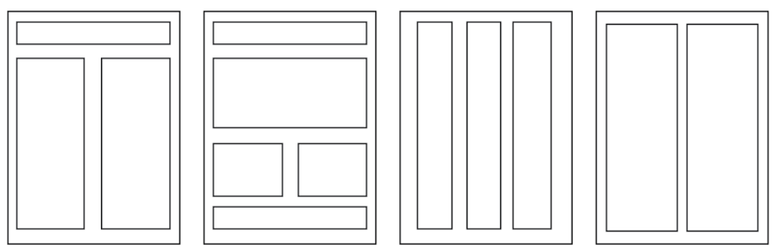
As I want the poster and book to be very informative and functional I decided to use a type based aesthetic with a bold and eye catching impact. To star the design process I created a range of possible thumbnails and layouts that could be used throughout the range.


COLOUR SCHEME:


I chose a very simple yet eye catching colour scheme of true black and white. The colours have a great impact and work well at showing the opposing views presented. The term "seeing things in black and white" means seeing two polar opposites which is also the concept between my design.

TYPEFACES:

APERCU:


I chose to use Apercu as my header font, it is bold, readable and very functional. I think the typeface works well for heads as it has a lot of impact and is easy to read

LEKTON:

Lekton is the typeface used for the body copy, It's clear form works well with the header font chosen. It is also reminiscent of a web coding font, which are typically seen as informative and functional.


Thursday, 24 April 2014

OUGD501 Design context: Concertina book binding workshop

OUGD501
DESIGN CONTEXT
CONCERTINA BOOK BINDING 
WORKSHOP


As part of the practical side of Context of practice i have decided to make a concertina book. I attended a concertina book binding workshop in order to gain the crafting skills needed to develop this technique. below show the steps to creating the book.


Making the book cover: