DESIGN CONTEXT
DESIGN DECISIONS
AESTHETIC:
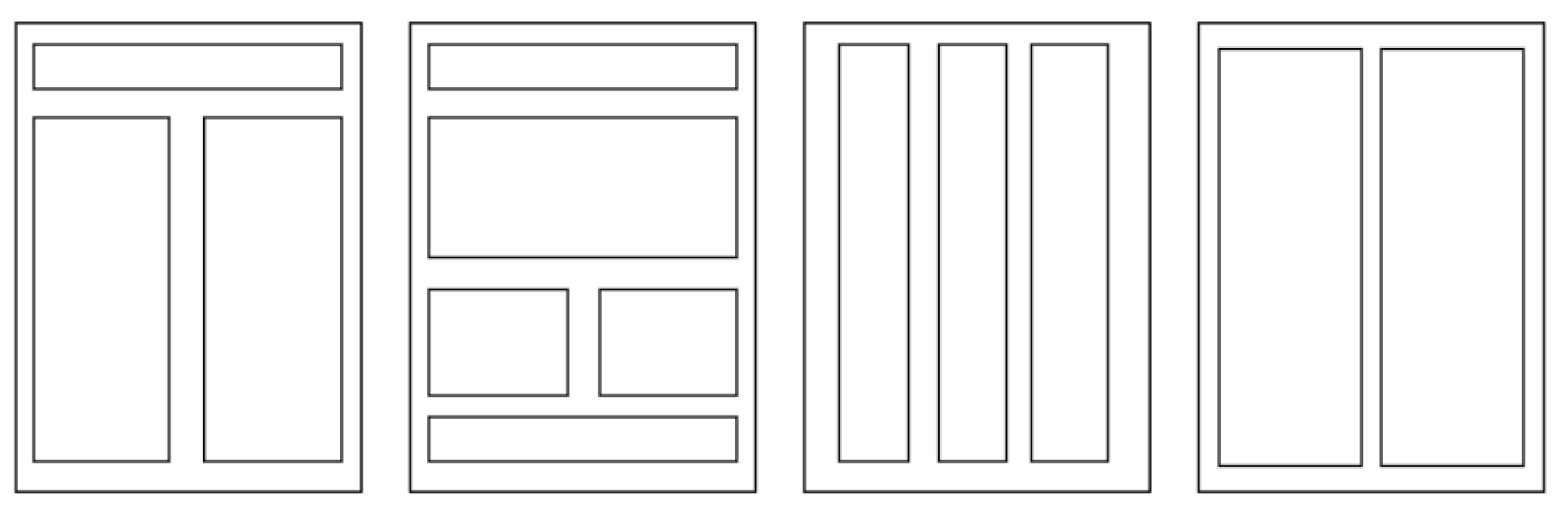
As I want the poster and book to be very informative and functional I decided to use a type based aesthetic with a bold and eye catching impact. To star the design process I created a range of possible thumbnails and layouts that could be used throughout the range.
COLOUR SCHEME:

I chose a very simple yet eye catching colour scheme of true black and white. The colours have a great impact and work well at showing the opposing views presented. The term "seeing things in black and white" means seeing two polar opposites which is also the concept between my design.
TYPEFACES:
APERCU:

I chose to use Apercu as my header font, it is bold, readable and very functional. I think the typeface works well for heads as it has a lot of impact and is easy to read
LEKTON:

Lekton is the typeface used for the body copy, It's clear form works well with the header font chosen. It is also reminiscent of a web coding font, which are typically seen as informative and functional.
No comments:
Post a Comment