"In the matter of layout forget art at the start and use horse-sense. The printing- designer’s whole duty is to make a clear presentation of the message - to get the important statements forward and the minor parts placed so that they will not be overlooked. This calls for an exercise of common sense and a faculty for analysis rather than for art" 1922, William Addison Dwiggins (successful designer)
Mechanized Art - Herbert Spencer
Visual Communication - Max Bill and Josef Muller Brockman
'Graphic design is the business of making or choosing marks, and arranging them on a surface to convey a design' - Richard Hols
Whatever the information transmitted, it must ethnically and culturally reflect its responsibility to society.
Peter Behrens
Piet Zwart
Peter Saville
Graphic Design is a relatively young discipline
Links between Graphic Design and different disciplines, e.g. Fine Art, Advertising are arguably becoming increasingly blurred
Although born out of consumerist/capitalist interests, Graphic Design is arguably becoming increasingly concerned with social issues
Wednesday, 24 October 2012

Thursday, 18 October 2012
OUGD406 Lecture Notes: Post Modernsim
- Modernism 1860 -1960
- Then logically post modernism is 1960s , today some people say we've left post modernism and have entered post - post modernism.
- Modernism is an aspirational reaction to world war 1 technology improves peoples lives.
- Post Modernism a reaction to these rules starts as a critical of the international style. only rule no rules , celebrates what might otherwise be turned kitsch.
- Post Modernism : complexity , chaos , bricolage - mixing up styles and materials. parody. Post aesthetic multiplicity of styles and approaches. Knowing juxtapositions or post modernism questioning old limitations.
- space for marginalised discourse.
- Las vegas- Post modernism city lots of small citys in one quite cheesy! e.g.. Egypt and Disney land.
- Papone V - 1955 - Green Imperative. saying how disney land is better than travelling around europe.
- Philip Johnson New york 1978-84 Sony plaza
- Pompidou center paris 1972-77
Gadgets
- Michael Groves kettle for alessi 1985
- Philippe Starck Juicy Salif - 1990 Orange Squeezer
These objects say something about the person who would purchase them at such high prices.
- Post modernism fashion - 1975 Vivienne Westwood sex boutique kings road London 'PUNK'
- Hussin Chalayn After World - 2006 Response to the civil ward 1988 unveiled chardo
- Andy Warhol Campbells soup can 1962 Pop art , high art pop culture, 'Everyone will be famous for 15 minutes'
- Jeff Koons , dirty Jeff on top 1992 - michael jackson & bubbles 1988
- Michael Craig Martin - Oak tree
Fine Art
- 1933 Damien Hirst Mother & child divided.
- Tracey Emin My bed -1998 & Everyone i have ever slept with.
- Chris Ofili - no woman no cry 1988 , holy virgin mary 1966. Representation Black roots & culture
- Martin Creed - Masking tape cube
- Longlords and bell - the house of Osama Bin Laden.2003
Graphic Design
- David Carson - Ray gun - Legibility - Don't mistake legibility for communication
- 1978 Barbara Kruger - ' i shop therefore i am ' Fine art & Graphic Design, Selfridges - buy me ill change your life.
- Rachel White Read 1993 - house statement of Britain in the 1990s
- The KLF band the k foundation - nailed to the wall 1994. ( notions of value)
- Richard Long - A line made by 1967 , Documented by photography w alking. A smell of sulphur in the wind.
Summary
- Post Modern attitude of questioning conventions esp. modernism
- Post modern aesthetics - Multiplicity of style and approaches.
- Shift in thoughts and theory crits and confidence
Post Modernism is indefinable.
Wednesday, 17 October 2012
Revolutionary Design In Russia: Notes


- Revolution = New opportunity for art to progress
- Constructivists desire to make art useful
- Aim that art should help 'construct' new society
- Use of new techniques and abstract aesthetic
- By the end of 1920s artistic freedom
- 1934 Stalin decrees 'Socialist Realism' only
Key points
- Russian Revolution led by lenin 1917
- 1971-1921 russian civil war
- 1917- mid 1920s intense artistic experimentation.
- The russian constructivists - leading avant - garde Artistic group
- 1921 Lenins new Economic Policy = Consumer goods needed Stepanvoa & Popova First state textile Factory, Moscow 1925 Paris Exposition Des arts decoratifs.
Thursday, 11 October 2012
OUDG401 Design Context: Image Analysis and Comparison

- World peace & war
- An advertisement for an oven
- Independence day
- Patriotic
- Celebrating
- Exports
- Trades
- Wild west fonts
- Everyone looking at sam
- Slavery
- America saving the world
- Undermining other cultures food
- Aimed at men (women didn't have money to buy an oven.)

- Alpha male (farther)
- Girl looking at her farther in admiration
- You couldn't be forced into joining the army
- The farther wanting to be the childs role model
- The font is personal to the readers choice
- 1915 - after ww1
- Very british
- Focussed on the farther
- Propaganda
- Type stands out
- Traditional
- They look well off higher class
- Serious expression
Two images in comparison
- Patriotic
- Strongly portray the American/British cultures - reflective of cultural differences?
- Aspirational lifestyles
- The choice and organisation of font and style of illustration
- The purpose and meaning of the image
- The target/potential audience of the image
- The social and historical contexts relevant to the production of the image
Analysis:-
The first, and most obvious feature that these two posters
have in common is their purpose. Both posters aim to persuade the audience, but
use contrasting techniques to sell their message.
The ‘Uncle Sam’s
Range’ poster’s aim is to sell a materialistic item, making the reader believe
that the need it to live the rich, free and independent American life style
that is so often talked about. The first way in which it does this is through
the use of the Uncle Sam, a patriotic and symbolic figure of the greatness of
America, the eagle is also a sign of patriotism. An over whelming use of the
colours red white and blue hold further connotations of this. Patriotism
follows through with a slightly racist and egotistical view that America is the
most superior country in the world. Such as the list of food, showing
generalisations that all Irish people eat is potatoes, but intern boasting the
wide range of dishes that you will be able to cook. Likewise the world war one
poster also tries to convey its message through patriotism. The poster denotes
a well off looking man, surrounded by his young family. This poster differs
from the first as it is using emotion and empathy to sell its message. There
are how ever some glaringly obvious signs of patriotism here, such as the rose
curtains (roses are the flower of England). The young boy is also playing with
toy soldiers, this intern shows his father as a heroic figure that young
children look up to. The type at the bottom of the page almost acts as a
rhetorical question. The fathers reading the poster will apply the question to
their own life and imagine what it would be like if their own children saw them
as a heroic and brave soldier.
Both posters in my opinion are targeted at the same
audience; Middle class, working men. At the time period of both of these
posters men were seen as the providers of the household, women were inferior to
the superiority and power that men of the time held. This gender inequality is
echoed through the use of imagery in the ‘Uncle Sam’ poster, as it is a woman
serving the food and men sitting at the table. At first I thought it was
strange to aim a product that would most probably be used solely by women at a
male target audience. But then I realised that as women were seen as inferior
they probably wouldn’t have been able to make such a purchase, or even suggest
it. Again in the world war poster, women would not have been able to join the
army, so its only audience would be men.
There is a strong sense of greatness and achievement in both
posters. From my research I found out that the world war poster was produced a
year in to the war. The fact that the poster is in the future of a man and his
young family connotes that the war was triumphant and all soldiers returned
home unharmed. I think this was done for a number of reasons. Firstly because
it is good to keep positive during times of crisis and secondly because of a slightly
arrogant view that England is the greatest country and our men would conquer.
Over all I think there are lots of similarities and
difference of each poster. Both aim to sell ideologies and concepts, almost
trying to brainwash the audience. However the imagery is very different but
works to the same effect.
OUGD401 Design Context: Prospectus Evaluation
In our seminar groups we had to look at the new Leeds College of Art prospectus. We looked and evaluated it from a artistic point of view. Baring in mind that we were the target audience of the previous prospectus a few months ago, we were effectively able to analyse and evaluate it and provide critical and credible feedback.

These are the things we noticed
- Front layout is badly designed and looks like a powerpoint template
- Bad layout of text
- Poor use of images
- Overwhelming use of text
- Subheading type works well
- The paper isn't high quality, the expensive finish with the text doesn't work
- Needs to be a better balance of image and type
- No mention of Leeds College of Art, or logo on the front of the
- The logo is on the back but isn't centrally aligned, the designer didn't take into consideration the width of the spine when designing.
- The sudden change of black paper with white text half way through doesn't work
- The change of paper colour (black/white) throughout is unnecessary
- Should be more image based
- Not visual enough for an arts college
- Text placed over some images is hard to read as it is in the same colour
- Images are poor quality, some look 'stock image' sourced
The first major negative criticism of the prospectus is some elements of the front cover. Firstly the colours do not work well together. The embossing technique used to print the main red title on to the cover is ineffective, the red colour is to transparent and is drowned out by the blue creating a dull colour. The cover would work better in a more simple, stylish black and white colour scheme. Secondly a major flaw of the prospectus is the non alignment of the college logo on the back cover. This mistake connotes unprofessionalism and a lack of attention to detail.
Another fault of the prospectus is a lack of navigation and direction throughout it. There is no real sense to the structure and order, and it is hard to extract relevant information from. Overall it looks like a prototype or unfinished product. I think there are certain elements that work, such as the titles and subtitles. However this prospectus is not an accurate, effective representation of the talent and creativeness that the university has to offer. The lack of attention to detail doesn't connote the professionalism and high standard of Leeds College of Art.
Wednesday, 10 October 2012
OUGD401 Lecture Notes: Modernism
- Terms- ‘modern’, ‘modernity’
- Modernity – Industrialisation, Urbanisation – the City
- Modern artists’ response to the city
- Psychology and subjective experience
- Modern art and photography
- Defining ‘modernism’ in art
- Modernism in design
Architecture 1977
- 15 july 1972 Modernism dies according to charles jencks - The demolotion of pruit.
- Paris 1900
- Trottoir Roullant - eletric walkway 'Urbanisation'
- Sites of Modernity
- paris 1850s = a new paris
- old paris architecure of narrow streets and srun down housing is ripped out hassuman city architect recreates paris
- Narrow streets easier for police dangerous, place.
- the experience of the individual in the modern world
- come cloe to the understanding
- modern art and the experience of modernity
- Anti-historcrism
- truth to materials
- form follows funtion
- technology
- internationalism
Summary
- Revolution = new opportunity for art to progress
- Constructivists desire to make art useful
- Aim that art should help 'construct' new society
- Use of new techniques and abstract aesthetics
- by end of 1920s artistic freedom curtailed
- 1934 'socialist realism' only.
Tuesday, 9 October 2012
OUGD401 Design Context: Love and Hate Task
LOVE:
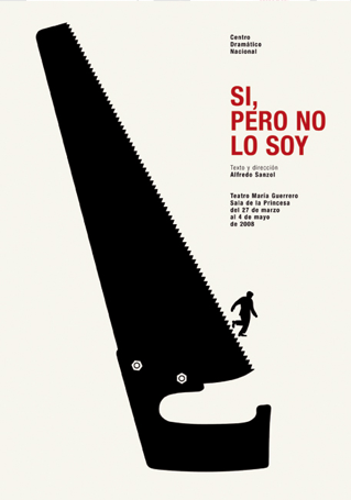
This is a design that i really love. I like all of Isidro Ferrer's work. In particular i like the clean minimal aesthetic of the poster. I like the creative, yet simpleness of the message portrayed. I also like the limited use of colour, The red colour stands out against the pale background, and adds a new dimension to the poster.
HATE:

This is a poster that i have a strong disliking for. I don't like the busyness of the colours, I also don't like the way the page is over crowded. There is a number of different contrasting typefaces that make the poster too cluttered. I don't think it is very stylised and not much effort has gone in to creating the poster. I also don't like the way none of the type is aligned.
Subscribe to:
Posts (Atom)