GRIDS AND LAYOUTS:


PHOTOSHOP:


I used blend tools to create this over lay effect. I decided that this was an interesting way to add colour to my publication.


Here are 2 of my layouts. I was inspired by the layout on the right and the hierarchy of text i am really pleased with it.

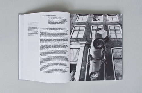
I think this is one of my strongest, most successful layouts. It is informative and functional. It deals with the hierarchy of texts and guides your eye around the whole double page spread. I am really pleased with this double page spread and plan to use it throughout my book, as a page breaker from the more abstract, creative layouts.

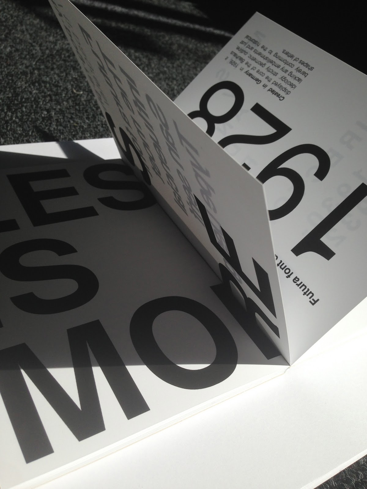
I really like this way of portraying the important teachings and ethos of the bauhaus. I think it is bold, eye catching and informative.
I Printed my publication in the digital print room. I decided that this was the most appropriate way to print it for a number of reasons. One reason is that it is the utilisation of new materials much like the teachings of the Bauhaus.

Printing my publication well in advance proved helpful as i noticed a glaring spelling mistake. Fortunately i had left my self enough time to get it reprinted.


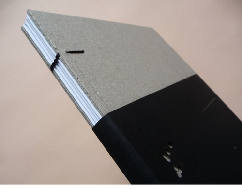
I then used the guillotine to trim my book, in order to make the pages perfect size and crisp.